

Specific, not superlative
Name the client, the standard, the year. If a claim can’t be backed, it goes.
Say: Building healthcare software since 2016.
Not: Industry-leading healthcare AI.

The lockup is the default: the elephant mark beside our name. Use the mark alone wherever a square fits better. Both come in exactly three colors.
Clear space is half the logo’s height on every side: a mark at half size fits the gap.
Smallest: lockup 24px tall, mark 16px.
Click one to copy its hex.
SVG for design tools and print, PNG for everything else. Each is shown on the background it was made for.
Don’t: Stretch or squash it
Don’t: Recolor it
Don’t: Tilt it or add effects
Don’t: Set it on a busy photo
Zowork
Writing about Zowork, or listing us as a partner? Take what you need. The words here are assembled from the same facts the rest of the site states, so they’re safe to paste as they are.
Three lengths, ready to paste.
Zowork builds the AI systems healthcare runs on.
Zowork is a healthcare and behavioral health AI and product engineering company. For a decade, since 2016, the team has been building clinical-grade AI: virtual scribes, conversation capture, and workflow infrastructure.
Zowork is a healthcare and behavioral health AI and product engineering company. For a decade, since 2016, the team has been building clinical-grade AI: virtual scribes, conversation capture, and workflow infrastructure. Long-running clients include Netsmart, eVisit, The Change Companies and Remarkable Health. The company works from four offices across three countries: Bangalore, Ahmedabad, Yokohama and Wilmington. Learn more at zowork.com.
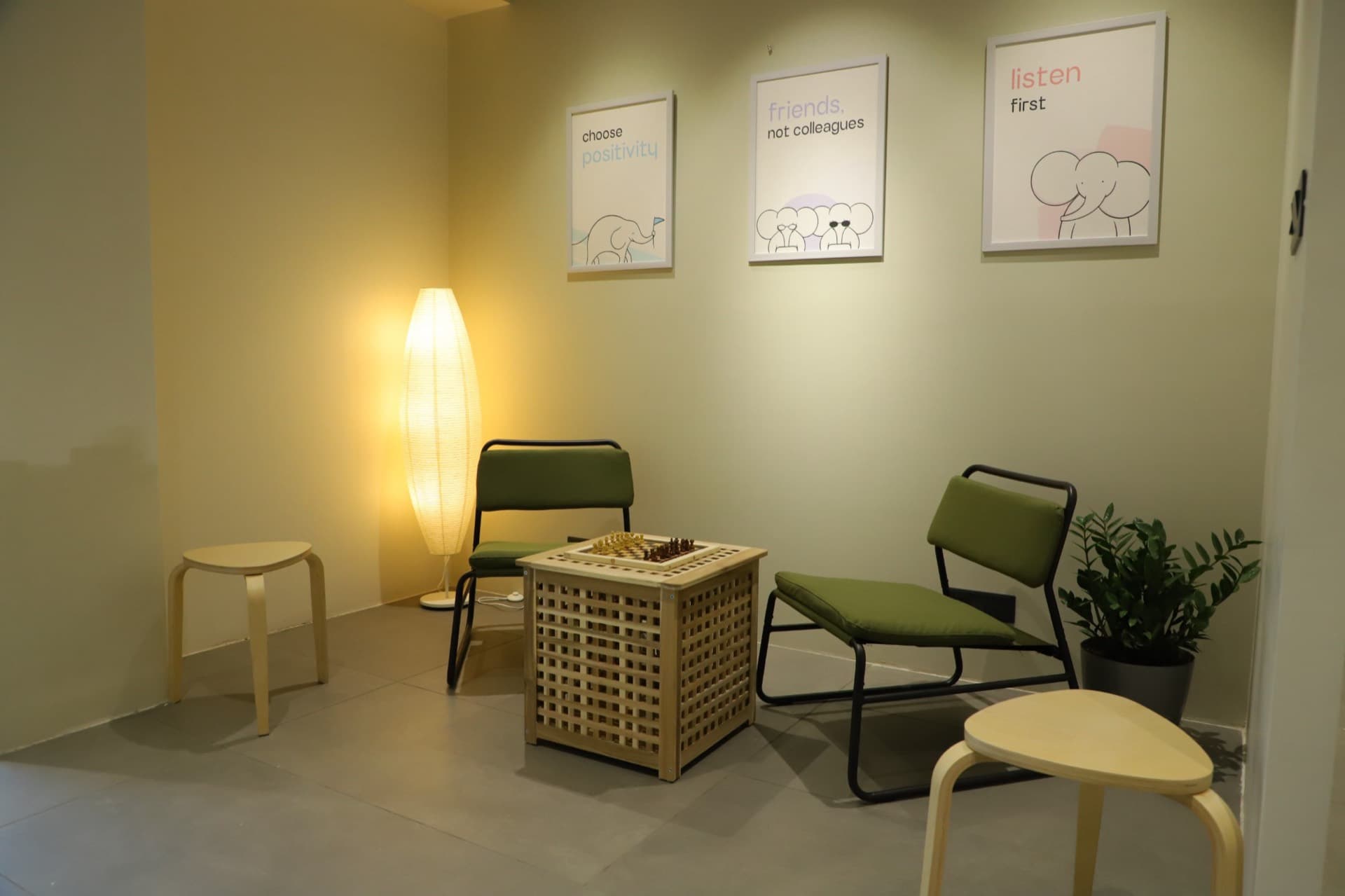
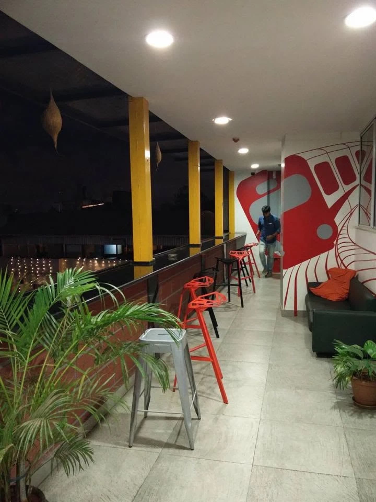
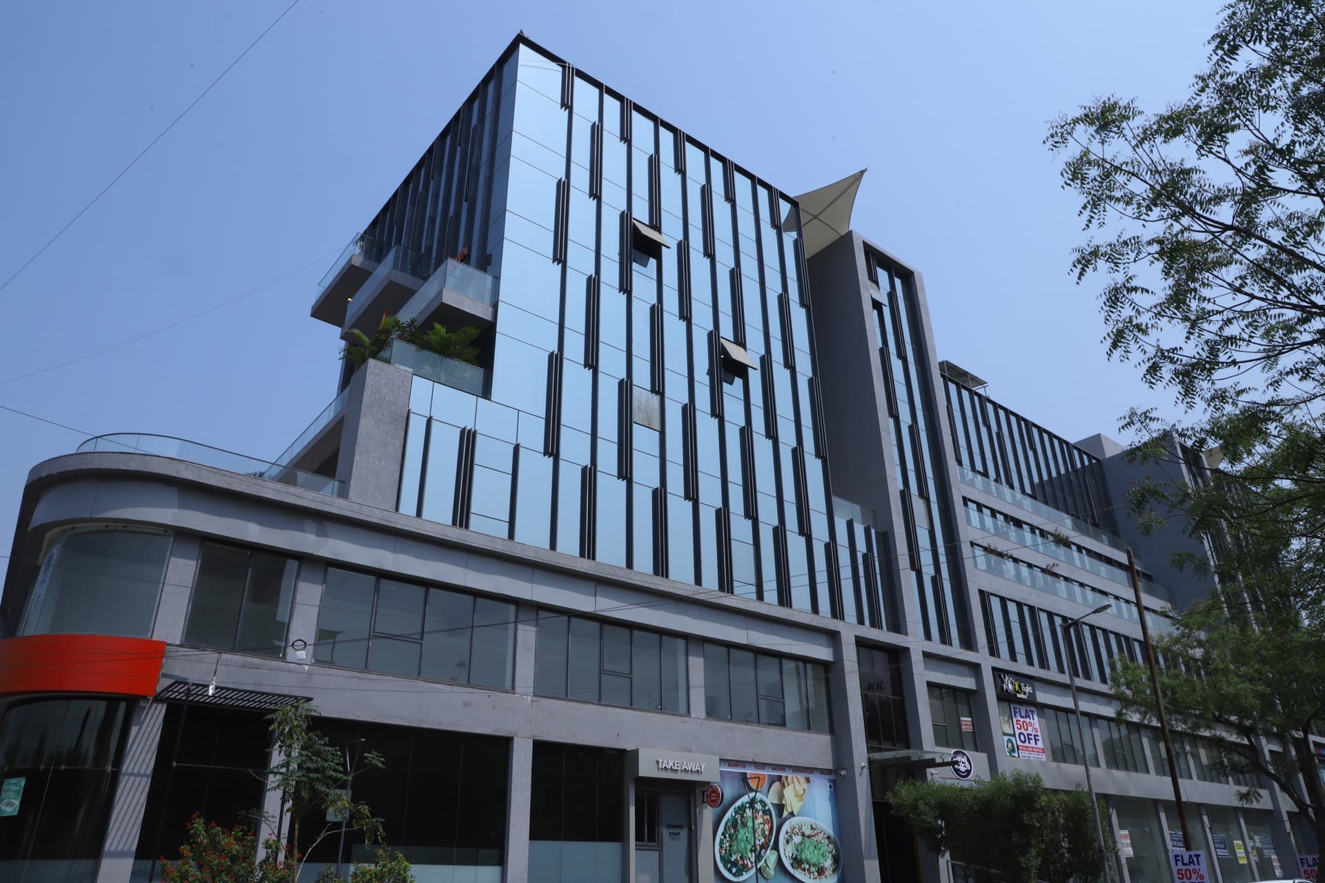
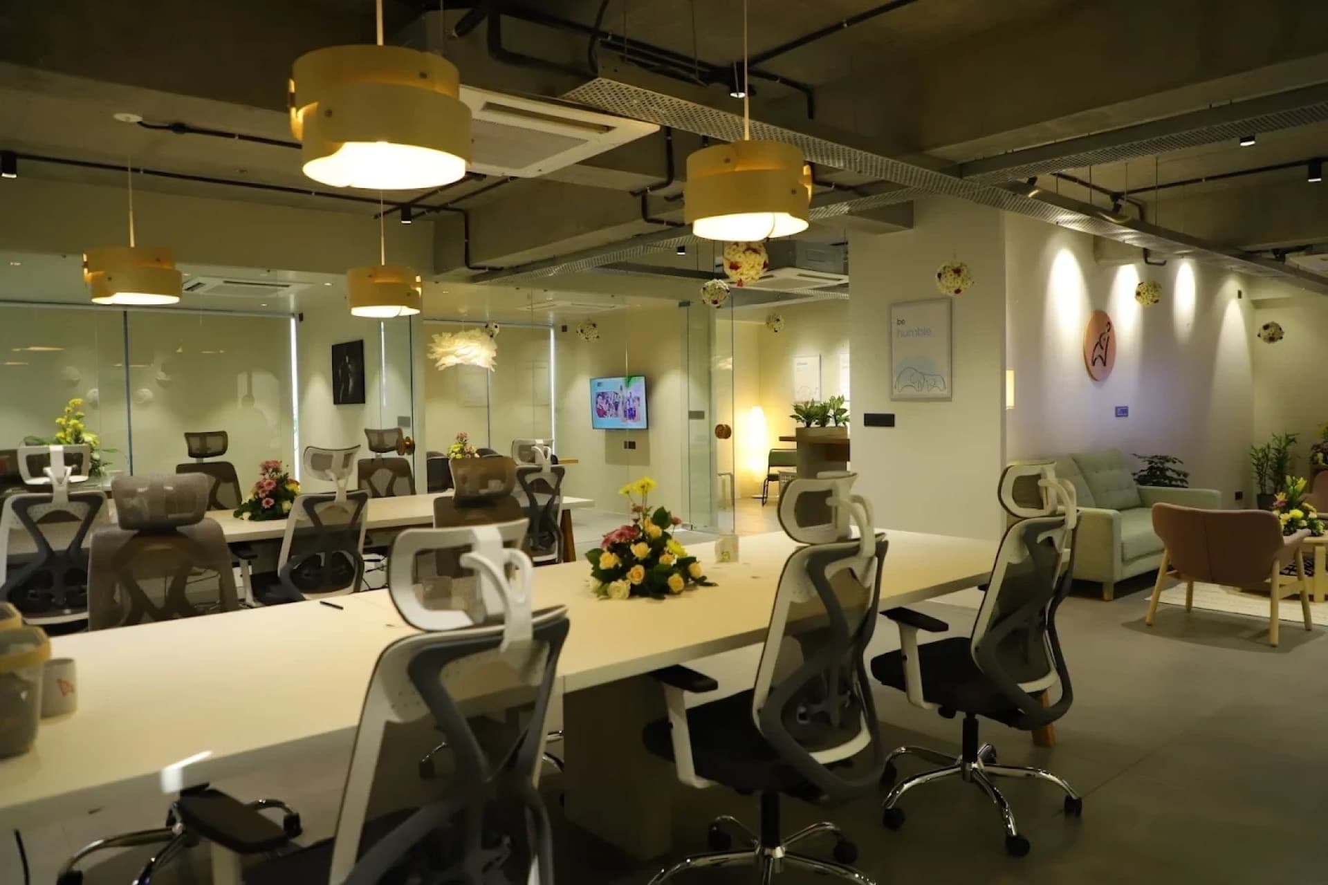
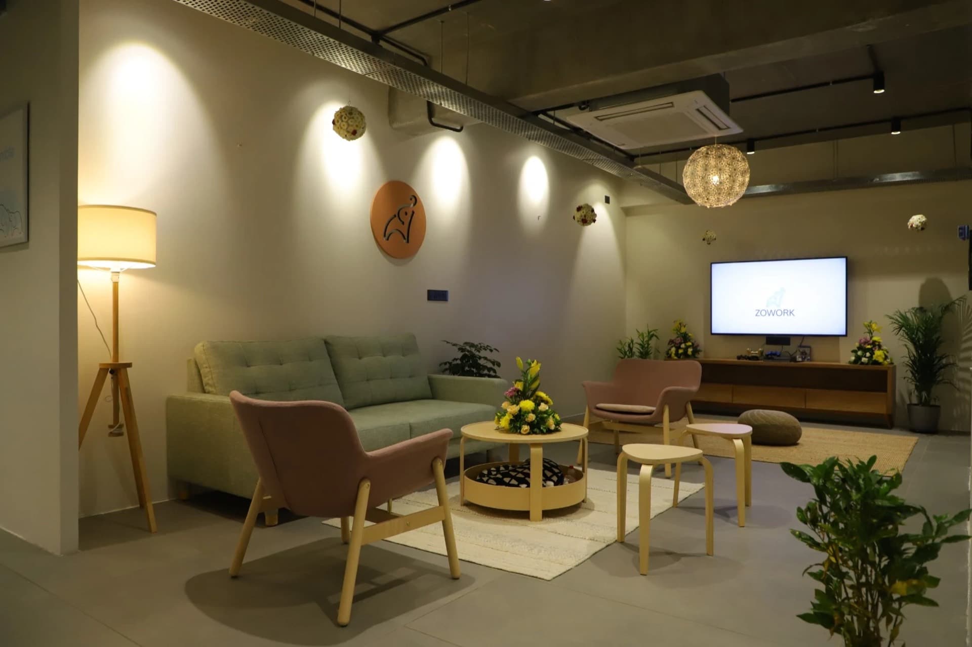
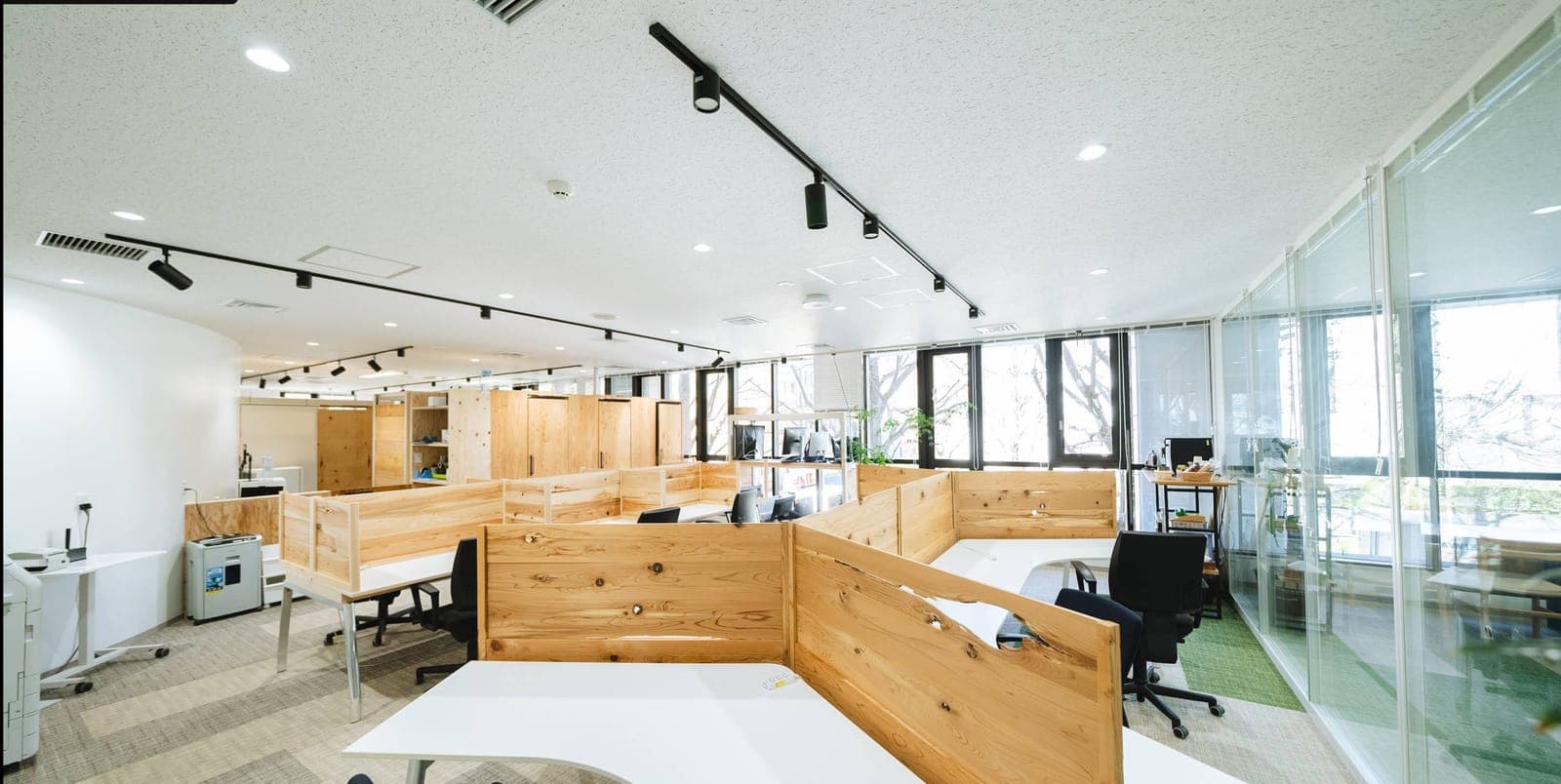
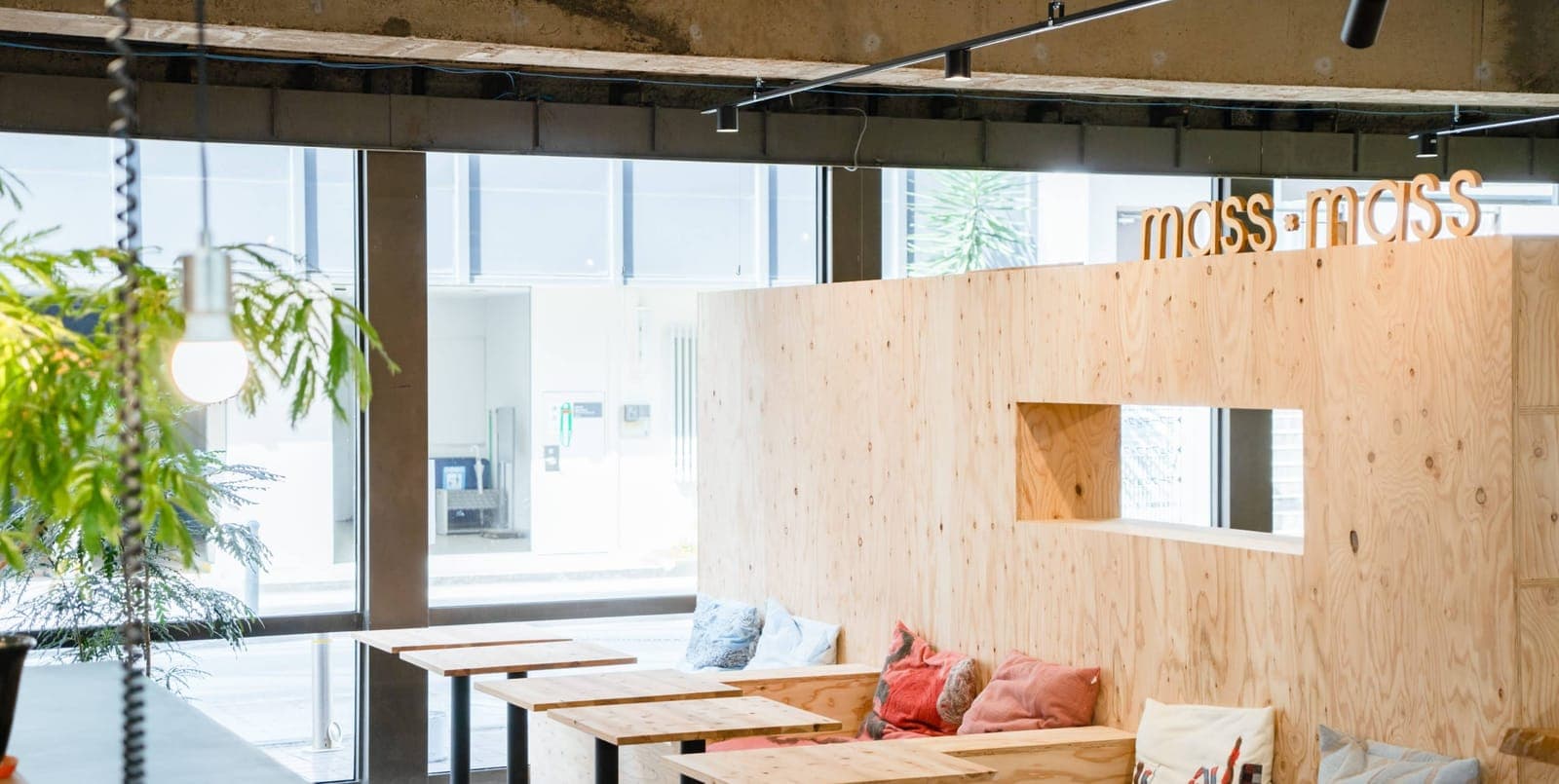
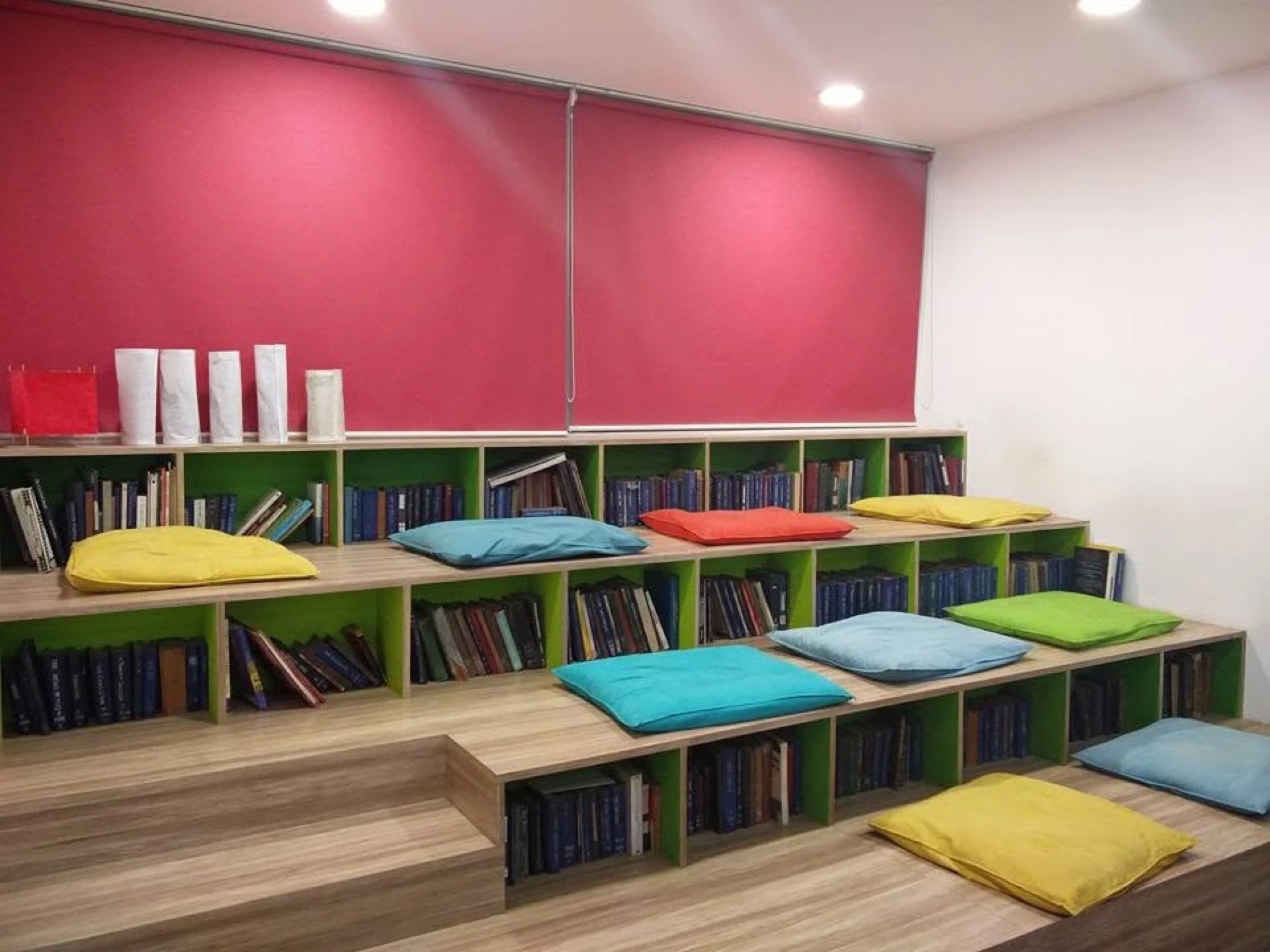
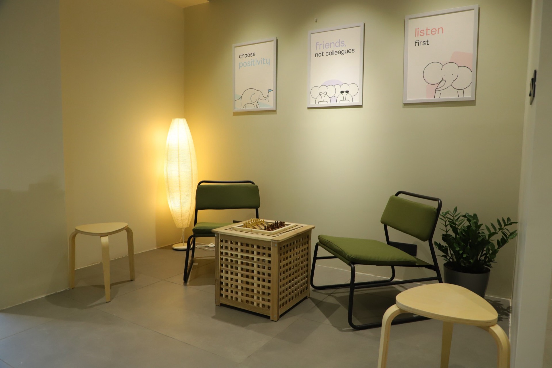
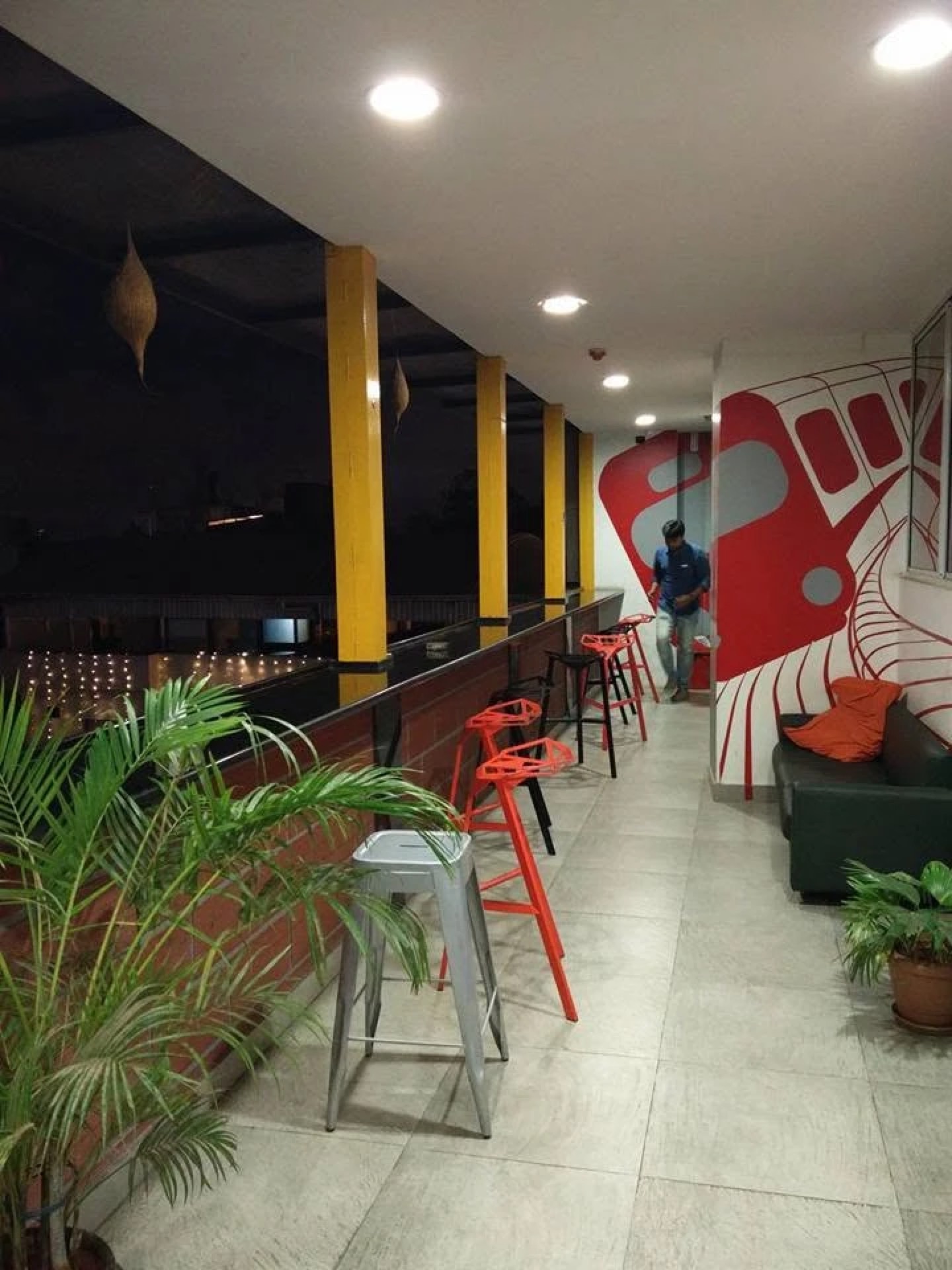
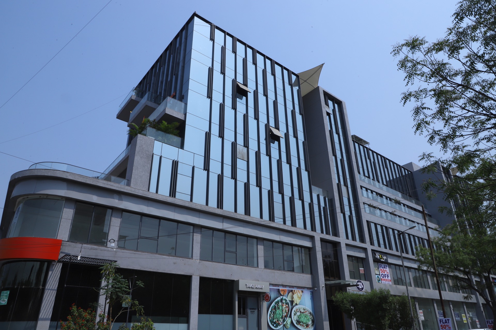
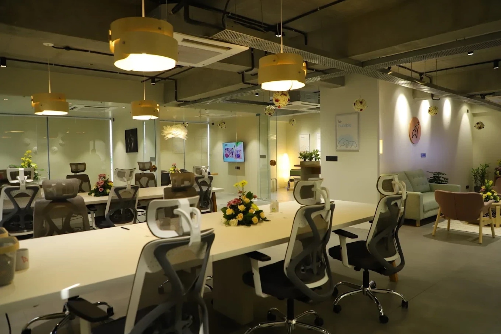
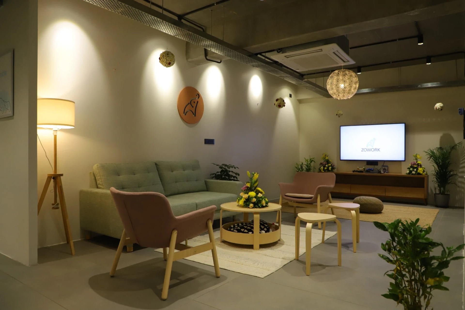
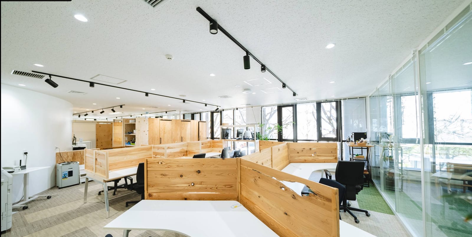
Our offices, as they are. For editorial coverage of Zowork. Please credit “Zowork”.
Writing about Zowork? Our team replies, usually inside a business day.
We write like an engineer who has shipped clinical software since 2016: calm, exact, and unimpressed by hype. Five rules keep it that way, on the site, in a deck and in a reply.
Name the client, the standard, the year. If a claim can’t be backed, it goes.
Say: Building healthcare software since 2016.
Not: Industry-leading healthcare AI.
Say what a lesser team would do, then what we do instead.
Say: PHI handling designed into the architecture from day one, not retrofitted after the demo.
Not: Secure, enterprise-grade and compliant.
A headline is a setup and a payoff, read in a single pass.
Say: Our team replies. Usually inside a business day.
Not: Revolutionizing healthcare with cutting-edge AI.
Contractions, plain verbs, and short sentences a busy CTO reads once.
Say: Book consultation
Not: Request a demo today!
AI assists and clinicians decide. Nothing implies an AI is licensed or makes a diagnosis.
Say: AI-assisted, clinician-reviewed.
Not: AI therapy.
The values this site is built from, read from the same tokens. A value that isn’t here is one we haven’t agreed on yet.
Click any swatch to copy its hex. Contrast is measured on the canvas; every text color clears WCAG AA.
One dark canvas. Depth comes from raised and sunken surfaces, never from a light mode.
Three steps of text. Anything under 14px uses Ink 2 or brighter.
Cyan is the one accent: the action, the focus ring, the thing to look at. Keep it under a tenth of any view.
Variety for a set of cards or figures, one at a time. None of them is a second brand color.
State only, never decoration, and always with a word beside it.
Two corals, on purpose. Logo coral belongs to the mark and lends itself to nothing else; Coral 400 is the interface’s.
Geist throughout: Sans for headlines and text, Mono for labels and figures. Both are free under the SIL Open Font License.
Fully round for anything you press, softly round for anything that holds content. Nothing in between.
Shadows, not borders. Elevation is a soft shadow with a hairline of light along the top edge; borders stay a whisper.
Felt more than seen. One curve for nearly everything, four durations, and a still version of every animation for anyone who asks for reduced motion.
Same distance, same 700ms.
The handful of moves that make a page read as ours before the logo appears.
A dark page, plenty of room, and one cyan thing to press.
Our team replies. Usually inside a business day.
The setup in ink, the payoff in a quieter fade.
Small capitals in Geist Mono, facts split by a middle dot.
Atmosphere rises from below the page, and stays soft.
Lucide at a 1.5 stroke, in ink. Color only when it means something.
Our mark, alone, wherever a square needs one.
The site’s own components, live. Hover them, tab through them, press them.
One primary action per view. Labels say what happens, in sentence case: “Book consultation”, never “Get started”.
A status always comes with a word. Color alone never carries the meaning.
48px tall, a mono label above. Cyan on focus; coral when something’s wrong, with the reason in words.
Content floats on a shadow and lifts when it leads somewhere.
Estimated at nine months by hand, delivered in fourteen weeks with zero production downtime. Agents did most of the mechanical conversion; senior engineers owned the architecture and reviewed every change.
Read the storyTraceability went from 40% to 100%, and audit evidence collection from about three weeks to two days, with the QA team reviewing what the agent drafted.
Read the story